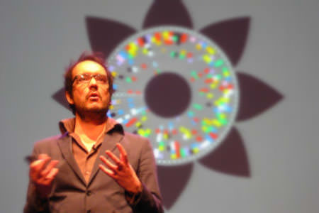
David McCandless
Information Is Beautiful
2010
About this talk
In an age of high-speed living and info overload, visualized information has incredible potential to help us quickly understand, navigate and find meaning in a complex world.
The use of infographics, data visualisations and information design is a rising trend across many disciplines: science, design, journalism and web. At the same time, daily exposure to the web is creating a incredibly design-literate population. Could this be a new language?
In his session, David will share his passion for this merging of design, information, text and story to unveil some of the interesting, unexpected and sometimes magical things that happen when you visualise data, knowledge and ideas. And, admitting that his book is as full of mistakes as it is successes, he’ll also explore some of the common pitfalls, traps and FAILS that dog this young design form.
Using examples from his book and blog, he’ll share thoughts on what makes a successful information visualisation and journalistic tips, especially for designers, on how to zero in on interesting data and subjects—and how designing information can expose your own biases and change your views about the world. Oh yeah!

 Photo by


